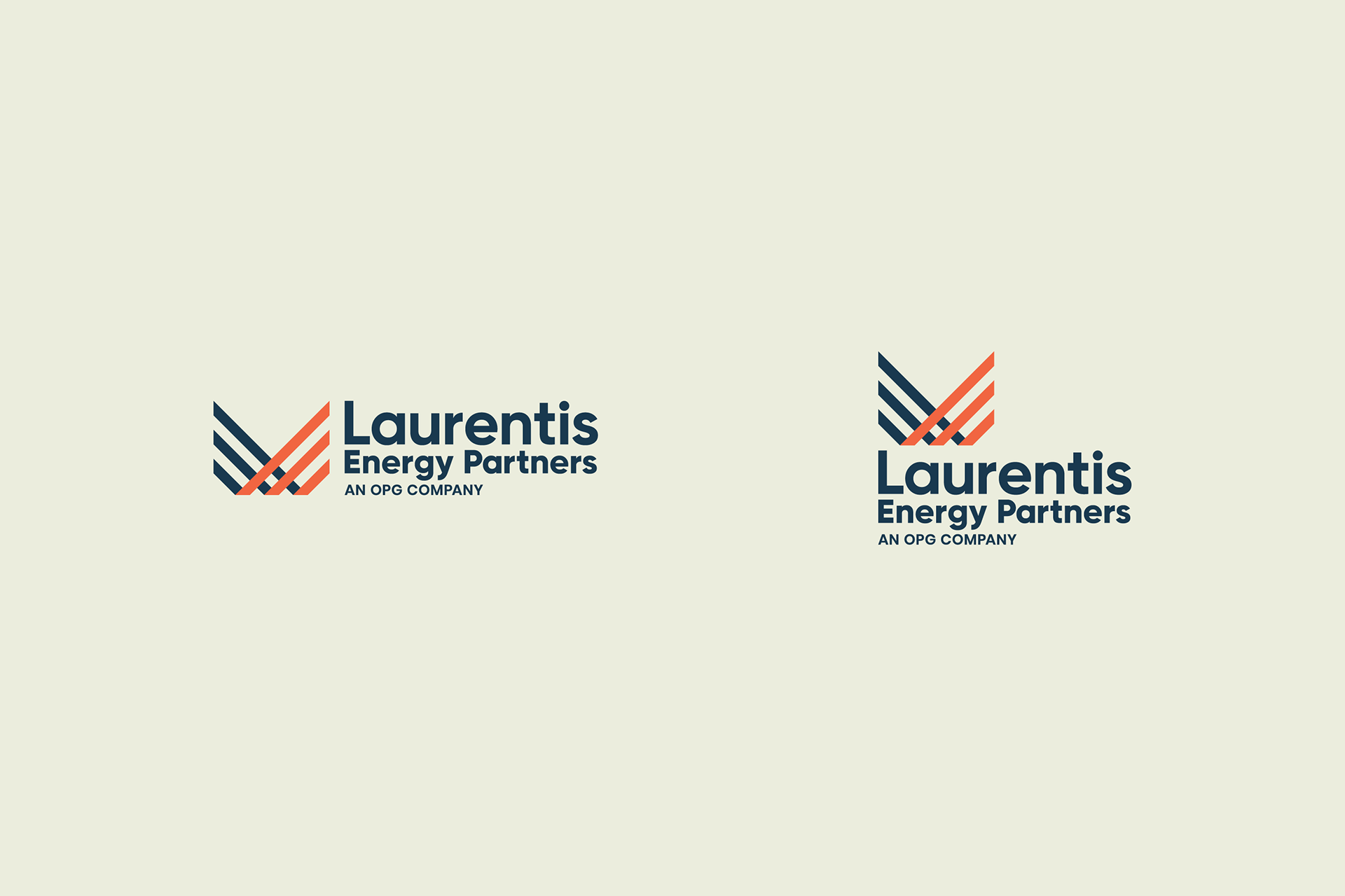
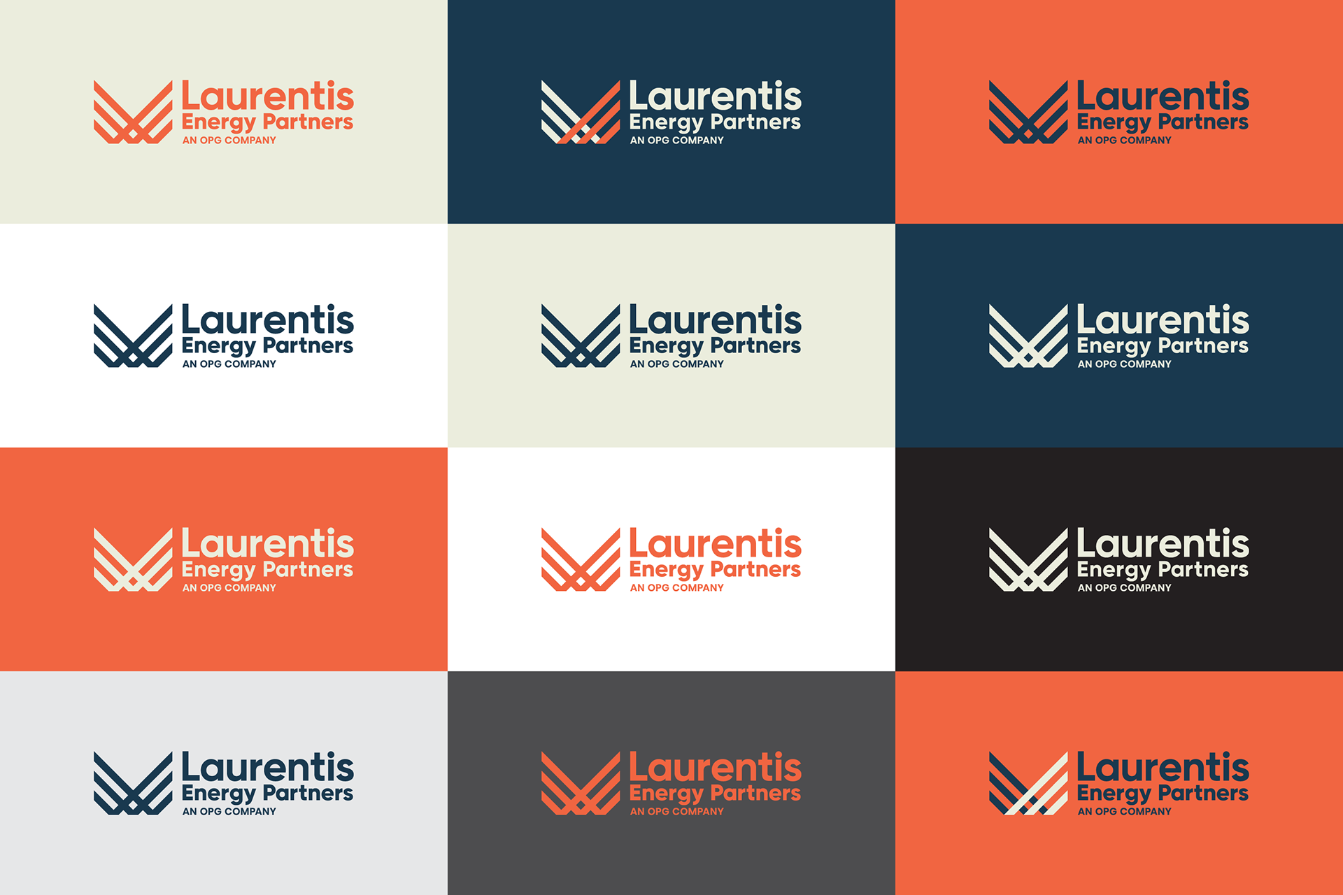
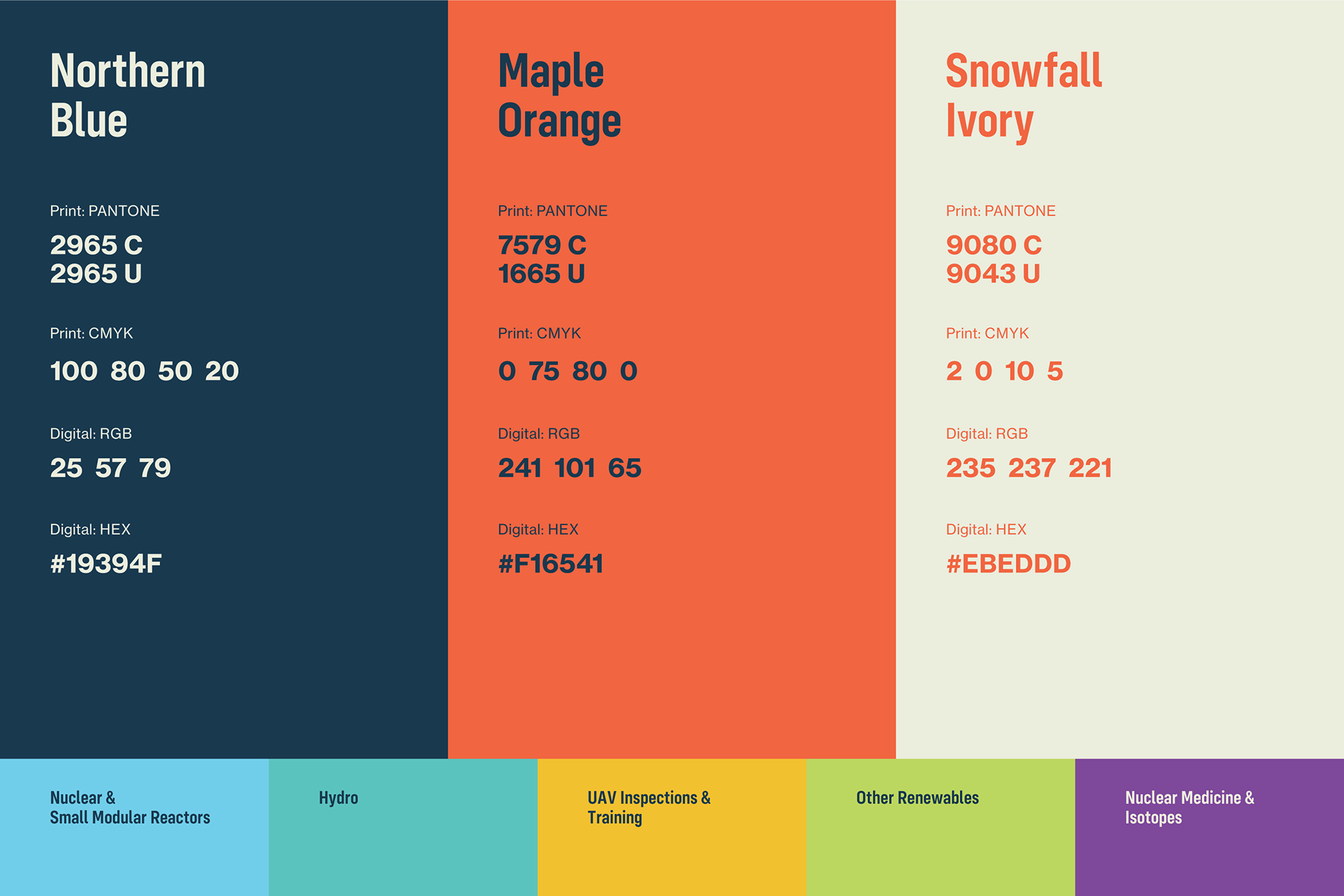
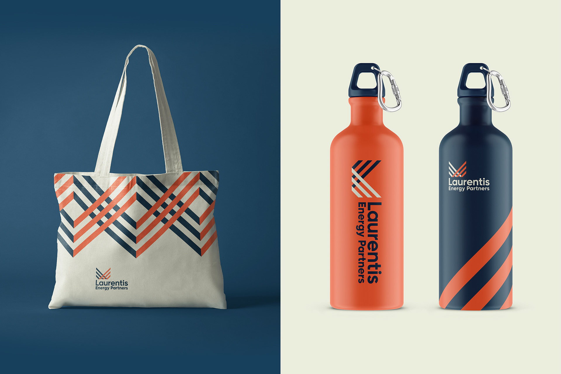
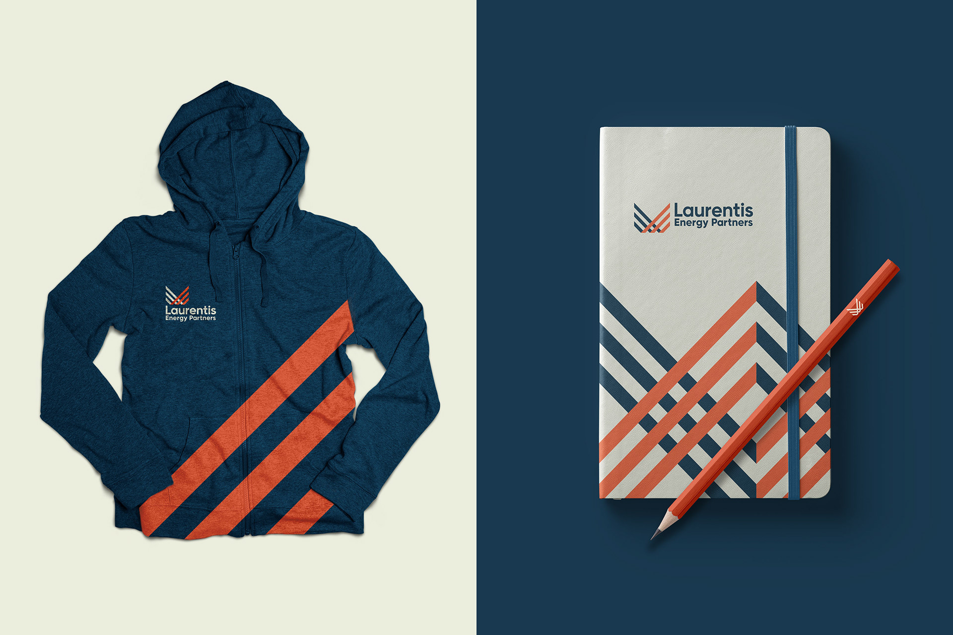
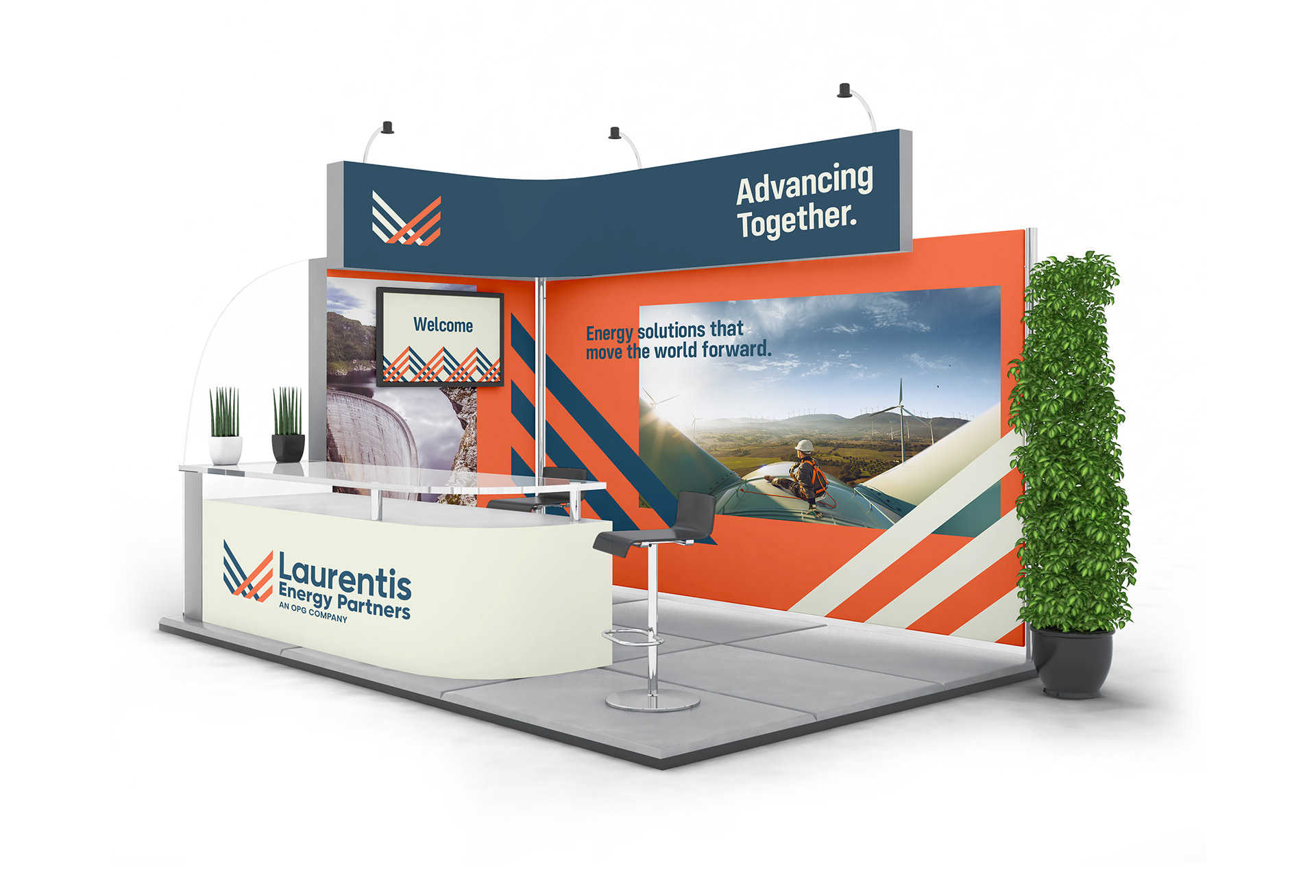
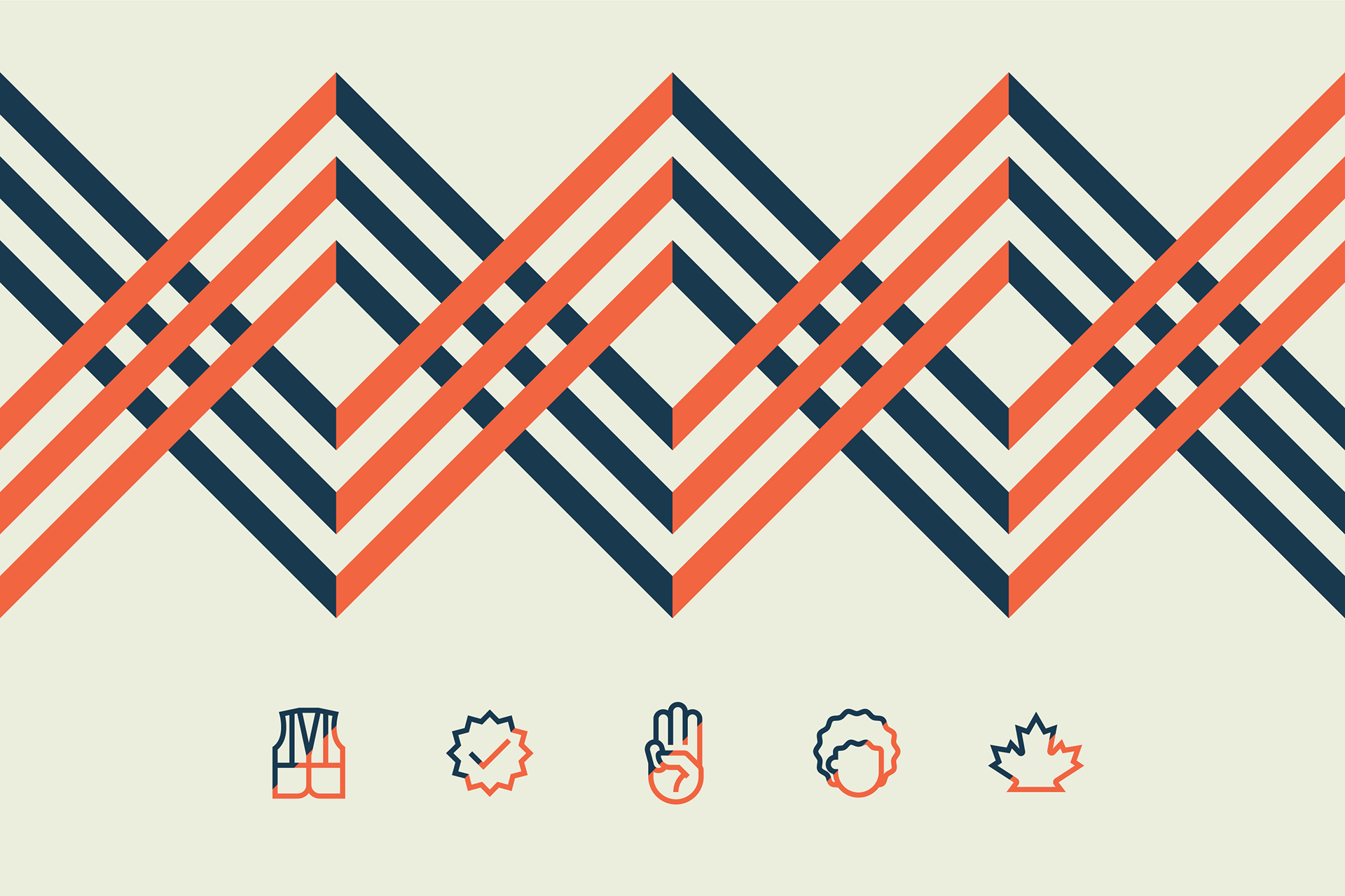
Branding for Laurentis Energy Partners, formerly Canadian Nuclear Partners. Laurentis is a Canadian provider of inspection, maintenance, engineering, and project management services for a wide range of energy sector industries around the world.
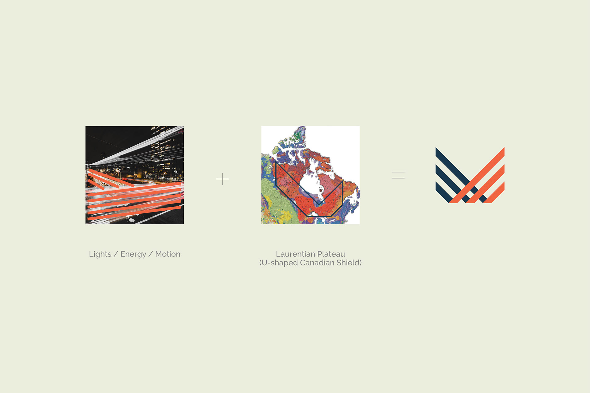
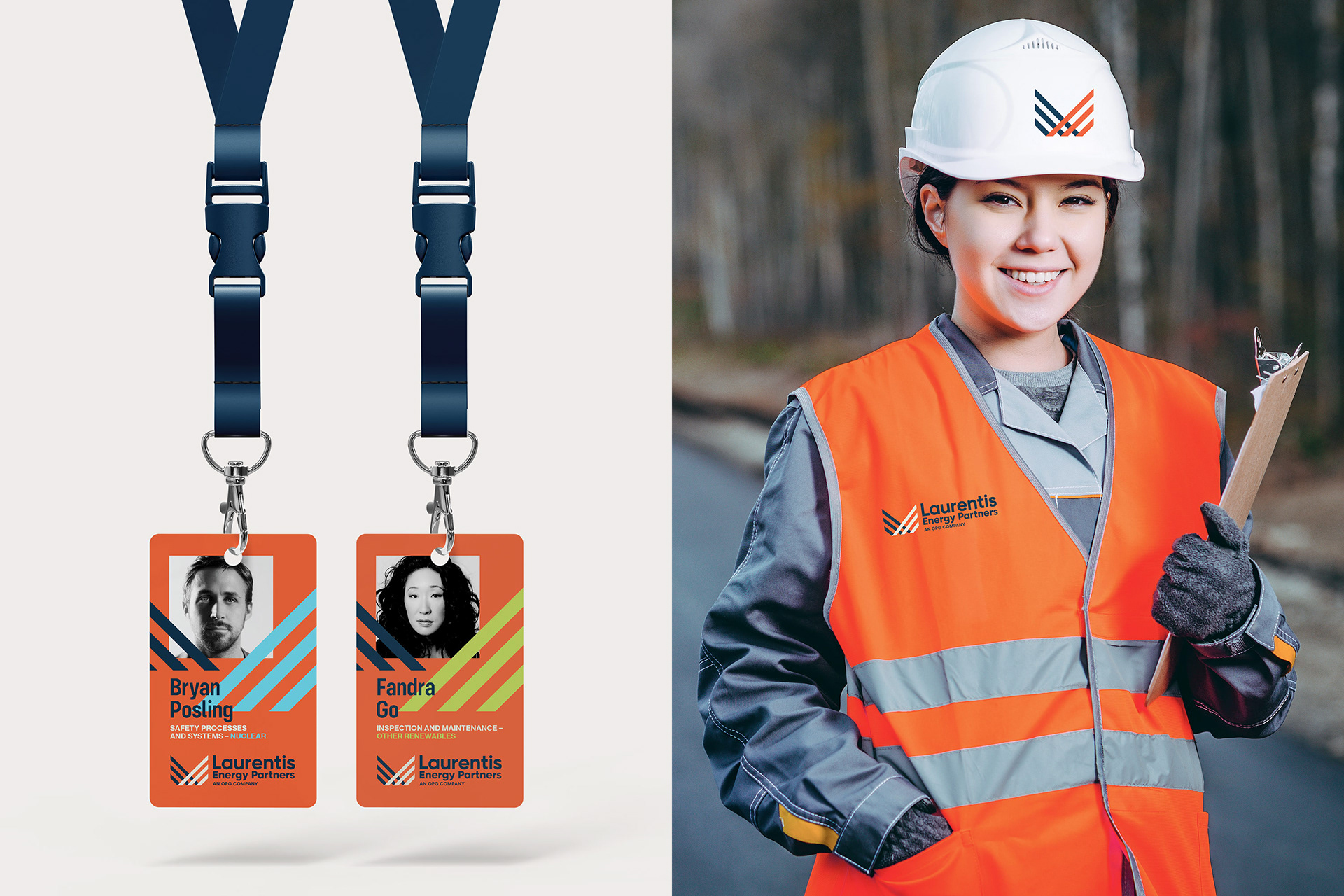
The logo is inspired by the U-shape of the Laurentian Plateau (Canadian Shield) — which represents strong Canadian foundation and the reflecting lines represent energy and advancing forward/together.
Team on this project: Stephen White, Matt Currie and Rick Amaral of Jacknife.
The logo is inspired by the U-shape of the Laurentian Plateau (Canadian Shield) — which represents strong Canadian foundation and the reflecting lines represent energy and advancing forward/together.
Team on this project: Stephen White, Matt Currie and Rick Amaral of Jacknife.